Current Campaign
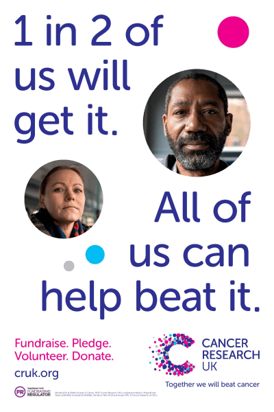
The target audience is the general public as it shows a Black man and a white woman making it appeal to a multi-cultural society. The ad campaign is clearly trying to signify the danger that cancer poses and how common it is. It also implies that their is a unity of us (humanity) against it which connotes that they don't discriminate but neither does cancer. The advert is short and simple making it easy memorable but also make the message seem more important as it isn't diluted. The advert uses personal identity to gain peoples interest as by showing multiple ages, genders and ethnicities in the advert allows it to appeal to a larger audience. The advert uses bold blue font to make the important and simple message stand out and to be easily memorable. The ad also uses simple denotative points Fundraise. Pledge. Volunteer. Donate. Which is straight to the point and makes the message far easier to remember and it keeps the attention span of the audience opposed to having a large wordy paragraph. Having the message in small simple points also makes the message come across as more important and quite brutal too; as if each point is an individual bullet shot into you. They use the idea of human equality and togetherness to bring people together in order to tackle cancer forever. By making the models look directly into the camera they are looking directly at the person reading the advert making it seem personalised. As well as this it also looks like the people who are aiding Cancer Research UK are judging you for not donating and doing the same as they are. On top of this the female model in the advert is looking down at the camera which puts her in a high angle and the audience in a low angle. Which suggests people who are doing nothing who are just sat at home are bad people or at least worse people than she is. But also connotes that if you too donate you can better yourself as a human.
January 4th 2022
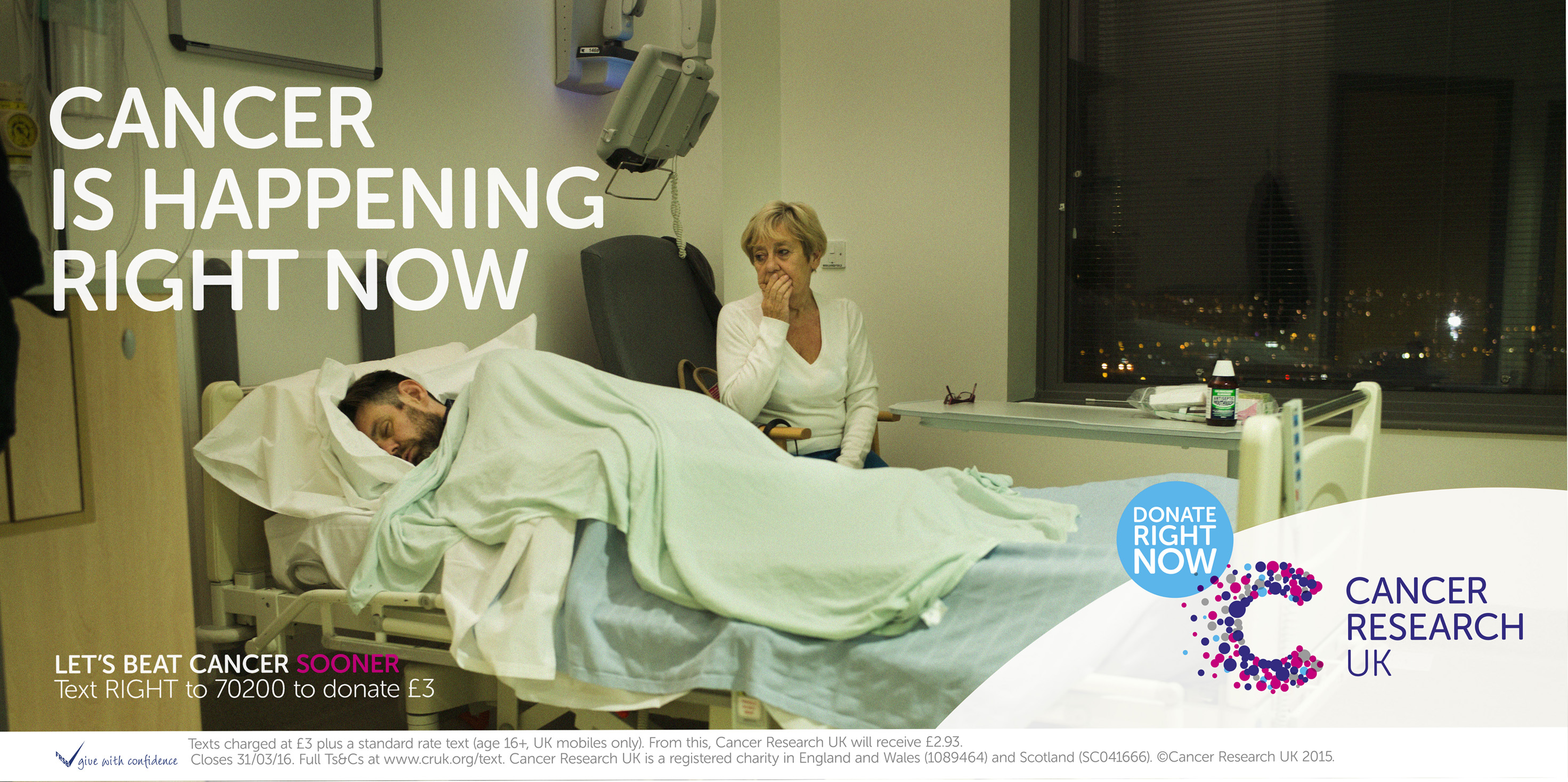
The target audience for this advertisement is parents; particularly mothers. This is because Cancer Research UK are showing an example mother, looking on with obvious worry and sadness. This is clearly meant to 'tug at the heart strings' of parents in the audience and make them feel empathy and sympathy towards the fearful mother. The fact that we can't see the face of the person in the bed properly allows parents watching to project their child's face on to that of the cancer patient further creating sympathy and empathy and the connotations of being 'put into someone else's shoes'. The advert is essentially 'guilt tripping' viewers into donating to them by juxtaposing them in their day to day lives such as on seeing the advert on a billboard whilst they are on their daily commute to and from work. Or whether they're sat at home together with their families and friends on the sofa; whilst they see a distraught mother who watches on from an empty and unforgiving hospital bedroom in the dead of night hoping above all hopes that her son will be ok. It also connotes that cancer is constant and that it wont stop so the donations and the research funded by them mustn't either. The ad campaign uses emotions such as empathy and sympathy in order to get people to donate to their charity, as people don't want to imagine themselves in that scenario, and will find themselves picturing them and their children in that hospital room despite their best efforts not to.
September 2018

The advert targets a mass audience by appealing to all cultures with a neutral colour scheme. It also appeals to mass general audience as it is talking about a disease which is a massive people killer and affects 1 in 2 of us. As well as the highest causation of cancer other than smoking. The advert brings across the fact that their is more than one main cause of cancer, as people generally think of smoking when they think of causes of cancer however cancer can be caused by many different things and can be completely random with its victims hence part of the reason why it is so nasty. The advert also juxtaposes the seriousness of the disease against a 'fill in the blanks' game of the word obesity as if they're playing a children's game of hangman opposed to talking about the main causes of a devastating disease. The ad campaign uses a simple colour scheme to make the ad become more noticeable, easier to remember and to come across as more serious as the black and white could be denoted as them being completely truthful and there being nothing else there. But could also be connoted as the insides of a doctor or GP's office where of course your diagnosis of cancer would be given. It also uses satirical comedy on peoples ignorance at other main causes of cancer as it is essentially making a dark joke about obesity being another big cancer risk and people either not knowing or not caring.

No comments:
Post a Comment